Page 1 of 1
Financial Time Series Customizing?
Posted: Mon Jun 09, 2008 1:12 pm
by jiangshachina
Hi,
I create a simple financial time series chart, you can find it at:
http://www.flickr.com/photos/jiangshach ... 7/sizes/o/
I have three questions:
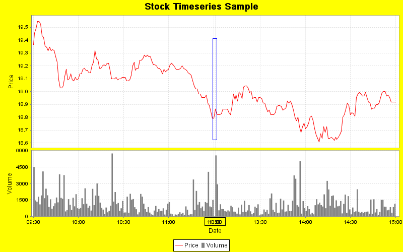
[1]Can I set the central value of Price axis? (Black rectangle indicates)
I know just get central value from Range, but set.
If I wish a specific value must be shown as a tick, e.g. the middle position in Number Axis, howto?
On financial charts, that's a common requirement.
For instance, the time series chart must show last day's close price, or today's open price in the middle.
[2]How to set the first tick and the last one? (Red rectangle indicates)
In my series, the time is from 09:30(including) to 15:00(including),
then I want the first date tick should be 09:30, and the last is 15:00, howto?
If I set a bit of LowerMargin and UpperMargin, that would be OK.
But if I set both of margins to 0.0D, then the result isn't my want.
[3]Don't show line between some times? (Green rectangle indicates)
JFreeChart use a line to connection two sequential points.
That's natural, but I don't want to show the chart/line in 11:30-13:00.
In fact, every stockmarket has its own work and rest time.
Then, howto?
Thanks!
Posted: Wed Jun 11, 2008 3:20 am
by jiangshachina
Does it mean JFreeChart couldn't achieve my goal?
Re: Financial Time Series Customizing?
Posted: Wed Jun 11, 2008 9:58 am
by david.gilbert
jiangshachina wrote:[1]Can I set the central value of Price axis? (Black rectangle indicates)
I know just get central value from Range, but set.
If I wish a specific value must be shown as a tick, e.g. the middle position in Number Axis, howto?
On financial charts, that's a common requirement.
For instance, the time series chart must show last day's close price, or today's open price in the middle.
The options are:
(1) Set the axis range manually, with the value you require at the centre of the range.
(2) Override autoAdjustRange() method in the axis to calculate the data range but then extend it to ensure that your prespecified value falls in the centre.
You could also call plot.addRangeMarker(new ValueMarker(...)) to highlight the central value.
jiangshachina wrote:[2]How to set the first tick and the last one? (Red rectangle indicates)
In my series, the time is from 09:30(including) to 15:00(including),
then I want the first date tick should be 09:30, and the last is 15:00, howto?
If I set a bit of LowerMargin and UpperMargin, that would be OK.
But if I set both of margins to 0.0D, then the result isn't my want.
This is a bug which occurs when the first tick mark falls right on the start of the axis. I'm still working out how to fix it properly.
jiangshachina wrote:[3]Don't show line between some times? (Green rectangle indicates)
JFreeChart use a line to connection two sequential points.
That's natural, but I don't want to show the chart/line in 11:30-13:00.
In fact, every stockmarket has its own work and rest time.
Then, howto?
If you add an item to the series with a null value (say at 12.00), then the connecting line will be broken.
Posted: Wed Jun 11, 2008 10:13 am
by jiangshachina
Hello,
Thanks the instruction very much.
This is a bug which occurs when the first tick mark falls right on the start of the axis. I'm still working out how to fix it properly.
Yes, in my case, when the left margin isn't enough, a "more right" tick unit would be shown.
a cup of Java, cheers!
Sha Jiang
Posted: Thu Jun 12, 2008 2:03 am
by jiangshachina
Hello,
With your instruction, I made some tests.
You could find the new image at:
http://www.flickr.com/photos/jiangshach ... 1/sizes/o/
(1) Set the axis range manually, with the value you require at the centre of the range.
(2) Override autoAdjustRange() method in the axis to calculate the data range but then extend it to ensure that your prespecified value falls in the centre.
You could also call plot.addRangeMarker(new ValueMarker(...)) to highlight the central value.
I just tried approach (1), the core codes are:
Code: Select all
numberAxis.setRangeAboutValue(344.15, 6.5);
off course, I used
Code: Select all
plot.addRangeMarker(new ValueMarker(344.15));
then you could find the highlighted central value.
But, how about the grid lines and ticks?
I expect one grid and one tick must fall at the central position.
I also tried TickUnit, like:
Code: Select all
NumberTickUnit numberTickUnit = new NumberTickUnit(1.15, new DecimalFormat(".00"), 1);
numberAxis.setTickUnit(numberTickUnit);
unfortunatelly, it didn't work well.
If you add an item to the series with a null value (say at 12.00), then the connecting line will be broken.
With the below codes, the line is broken, but... the big "gap" is still there.
I wish 11:30 and 13:30 share a same point. Can I?
Code: Select all
// formatter is a DateFormat instance.
series.add(new TimeSeriesDataItem(new Minute(formatter.parse("200806111200")), null));
Thanks!
Posted: Fri Jun 13, 2008 10:17 pm
by RoyW
For the gap you should take a look at SegmentedTimeline either in the JavaDoc or search the forum.
As for the highlighted central value this is something missing from JFreeChart. It would be nice to ba able to add annotations to the axis the same way you can to the plot. I find that for financial charts labels are required for the current price and other indicators. Your only solution in this case it to subclass the NumberAxis.
Here is a quick fix that only works for Vertical Charts with the Axis on the Right.
Code: Select all
NumberAxis  rangeAxis        = new NumberAxis("Price"){
            public List refreshTicks(Graphics2D g2, AxisState state, Rectangle2D dataArea, RectangleEdge edge) {
                List result = super.refreshTicks(g2, state, dataArea, edge);
                Tick tick = new NumberTick(344.15, "-----Close", TextAnchor.CENTER_LEFT, TextAnchor.CENTER_LEFT, 0.0);
                result.add(tick);

                return result;
            };
        };
Posted: Sun Jun 15, 2008 7:35 am
by jiangshachina
Thanks!
I'll have a try.
Posted: Sun Jul 27, 2008 2:44 pm
by jiangshachina
I have tried SegmentedTimeline(maybe too late *_*).
As mentioned above, the valid time ranges are: 09:30-11:30, 13:00-15:00.
I made a SegmentedTimeline:
Code: Select all
SegmentedTimeline segmented = new SegmentedTimeline(SegmentedTimeline.MINUTE_SEGMENT_SIZE, 1351, 89);
segmented.setBaseTimeline(SegmentedTimeline.newMondayThroughFridayTimeline());
// Starttime is 13:30
segmented.setStartTime(SegmentedTimeline.firstMondayAfter1900() + 780 * SegmentedTimeline.MINUTE_SEGMENT_SIZE);
The image is shown as the followings,
Obviously, the chart has a flaw(black rectangle indicates): The ticks 11:30 and 13:00 overlap each other.
How to resolve the trouble?
Additionally, can I erase the dashed at 11:30 and 13:00(blue rectangle indicates)?
Thanks!
Posted: Sun Jul 27, 2008 4:00 pm
by magice
For your last problem
I guess I can help you~hehe
you can try
1、set your TimeRange from 09:29 to 15:01
2、
SegmentedTimeline segmented = new SegmentedTimeline(SegmentedTimeline.MINUTE_SEGMENT_SIZE, 1350, 90);
wish you a good luck!
by the way, I am also a chinese guy, and study the jfreechart ,wish a further talk with you!
my qq:8163090
Posted: Mon Jul 28, 2008 10:20 am
by jiangshachina
you can try
1、set your TimeRange from 09:29 to 15:01
2、
SegmentedTimeline segmented = new SegmentedTimeline(SegmentedTimeline.MINUTE_SEGMENT_SIZE, 1350, 90);
Thanks for the reply, but that's not my want

Posted: Mon Jul 28, 2008 11:02 am
by jiangshachina
I made some segmented Candlestick charts, and also have some puzzles.
As show as the below,
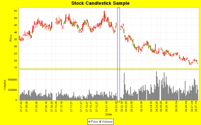
although I use SegmentedTimeline:
Code: Select all
SegmentedTimeline segmented = SegmentedTimeline.newMondayThroughFridayTimeline();
the chart has some "gaps"(the blue rectangle shows).
In fact, there isn't any data between "2008.02.05" and "2008.02.13".
Of course, that's natural. Because there are some excpetion segments.
Since the 08.02.09 and 08.02.10 are weekend days, then I have to add "2008.02.06", "08.02.07", "2008.02.08", "2008.02.11"
and "2008.02.12" as exception, the codes like:
Code: Select all
segmented.addException(DateUtilities.createDate(2008, 2, 6));
    segmented.addException(DateUtilities.createDate(2008, 2, 7));
    segmented.addException(DateUtilities.createDate(2008, 2, 8));
    segmented.addException(DateUtilities.createDate(2008, 2, 11));
    segmented.addException(DateUtilities.createDate(2008, 2, 12));
    segmented.addException(DateUtilities.createDate(2008, 2, 10));
then I get the result:

But..., I have to say I'm troubled by the approach.
Each year may have different holiday, but I have to set all of
accurate exception days.
In the future(after finishing all of coding), I may modify some codes(at least, some configuration file) when the holiday is changed.
Can the charting just depends on the
data provided, but
time-related things?
Thanks!
Posted: Fri Aug 01, 2008 8:35 am
by jiangshachina
jiangshachina wrote:I have tried SegmentedTimeline(maybe too late *_*).
As mentioned above, the valid time ranges are: 09:30-11:30, 13:00-15:00.
I made a SegmentedTimeline:
Code: Select all
SegmentedTimeline segmented = new SegmentedTimeline(SegmentedTimeline.MINUTE_SEGMENT_SIZE, 1351, 89);
segmented.setBaseTimeline(SegmentedTimeline.newMondayThroughFridayTimeline());
// Starttime is 13:30
segmented.setStartTime(SegmentedTimeline.firstMondayAfter1900() + 780 * SegmentedTimeline.MINUTE_SEGMENT_SIZE);
The image is shown as the followings,
Obviously, the chart has a flaw(black rectangle indicates): The ticks 11:30 and 13:00 overlap each other.
How to resolve the trouble?
Additionally, can I erase the dashed at 11:30 and 13:00(blue rectangle indicates)?
Thanks!
Oh, I missed a big thing.
I have tried SegmentedTimeline, why I forget Tick
RoyW wrote:For the gap you should take a look at SegmentedTimeline either in the JavaDoc or search the forum.
As for the highlighted central value this is something missing from JFreeChart. It would be nice to ba able to add annotations to the axis the same way you can to the plot. I find that for financial charts labels are required for the current price and other indicators. Your only solution in this case it to subclass the NumberAxis.
Here is a quick fix that only works for Vertical Charts with the Axis on the Right.
Code: Select all
NumberAxis  rangeAxis        = new NumberAxis("Price"){
            public List refreshTicks(Graphics2D g2, AxisState state, Rectangle2D dataArea, RectangleEdge edge) {
                List result = super.refreshTicks(g2, state, dataArea, edge);
                Tick tick = new NumberTick(344.15, "-----Close", TextAnchor.CENTER_LEFT, TextAnchor.CENTER_LEFT, 0.0);
                result.add(tick);

                return result;
            };
        };
I set some DateTicks with preferred TextAnchor, then the trouble disappeared.
The yellow horizontal line
Posted: Thu Aug 14, 2008 3:05 am
by Aniket_kedari
Hi sha,
Very interesting code.
I want to know how you drew the horizontal yellow line.
I will be thankful if you provide the code sniplet.
Thnaks
Re: The yellow horizontal line
Posted: Thu Aug 14, 2008 4:19 pm
by RoyW
Aniket_kedari wrote:
I want to know how you drew the horizontal yellow line.
I don't see a horizontal yellow line. I see 2 charts in a CombinedDomainXYPlot on a yellow background
Re: The yellow horizontal line
Posted: Sat Sep 20, 2008 10:08 am
by jiangshachina
Aniket_kedari wrote:
I don't see a horizontal yellow line. I see 2 charts in a CombinedDomainXYPlot on a yellow background
Yeah