Thanks a lot for the JFreeChart, it is really amazing!
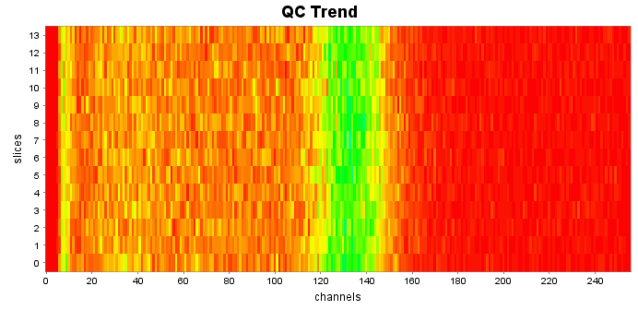
I am using it to create a block chart like this using an XYZDataset, XYBlockRenderer and XYPlot (each row is a spectrum acquired every twelve hours):
but then I wanted to change the Y axis to display the acquisition time of the spectra and not just it's ID. So I have changed the YAxis from NumberAxis to DateAxis and the y values in the dataset to milliseconds (and I have also added a PaintScaleLegend for the SclaeAxis, thanks for the tip in one of the posts in this forum http://www.jfree.org/phpBB2/viewtopic.php?f=3&t=29922). But now the chart looks like this:
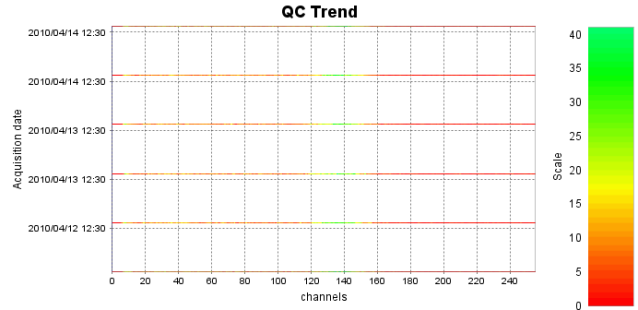
I don't understand why has it changed that way and how can I make it look like it was before. Any suggestions?
Here is the code for the yAxis before:
Code: Select all
NumberAxis yAxis = new NumberAxis("slices");
yAxis.setStandardTickUnits(NumberAxis.createIntegerTickUnits());
yAxis.setLowerMargin(0.0);
yAxis.setUpperMargin(0.0);
Code: Select all
DateAxis yAxis = new DateAxis("Acquisition date");
SimpleDateFormat at = new SimpleDateFormat("yyyy/MM/dd hh:mm");
yAxis.setDateFormatOverride(at);
yAxis.setTickUnit(new DateTickUnit(DateTickUnitType.HOUR,12, at));
yAxis.setTickMarkPosition(DateTickMarkPosition.MIDDLE);
yAxis.setLowerMargin(0.0);
yAxis.setUpperMargin(0.0);