A discussion forum for JFreeChart (a 2D chart library for the Java platform).
-
FourW Support
- Posts: 7
- Joined: Mon Jan 14, 2019 3:17 pm
- antibot: No, of course not.
Post
by FourW Support » Fri Feb 22, 2019 4:13 pm
Hi,
We faced one weird problem in graphs. when we tried to increase no.of bars in graph more than 100, The Time and value labels are disorted.
We attached the screenshot with is post, which shows some white lines appears in Time and value labels.
Help us to avoid this problem.
Thanks,
4W Technologies.

-
david.gilbert
- JFreeChart Project Leader
- Posts: 11734
- Joined: Fri Mar 14, 2003 10:29 am
- antibot: No, of course not.
-
Contact:
Post
by david.gilbert » Wed Feb 27, 2019 6:40 am
I guess the permissions on your dropbox don't allow others to access the image. Can you upload it somewhere else?
-
FourW Support
- Posts: 7
- Joined: Mon Jan 14, 2019 3:17 pm
- antibot: No, of course not.
Post
by FourW Support » Wed Feb 27, 2019 3:48 pm
We found a site which will work. Please refer the image below.

-
John Matthews
- Posts: 513
- Joined: Wed Sep 12, 2007 3:18 pm
Post
by John Matthews » Wed Feb 27, 2019 6:13 pm
Similar artifact pervades the entire image, which suggests that the chart has been
resampled, perhaps repeatedly.
- Verify that you render the image at the largest practical size before downsampling.
- Verify that you don't inadvertently downsample the image and then upsample the image.
- Verify that you don't lose quality with an inappropriate encoder in your processing pipeline.
- Consider using AffineTransformOp to determine the optimal interpolation type for your use case, for example.
- Consider using a StandardXYBarPainter, examined here.
-
FourW Support
- Posts: 7
- Joined: Mon Jan 14, 2019 3:17 pm
- antibot: No, of course not.
Post
by FourW Support » Fri Mar 08, 2019 11:50 am
The actual problem is when we tried to increase bar count more than 100 then the time labels are overwriting(refer the image below).

We changed time label color as white except 5. So the overwritten white lines appeared on the visible 5 time labels, It views like distorted text.(refer the image below)
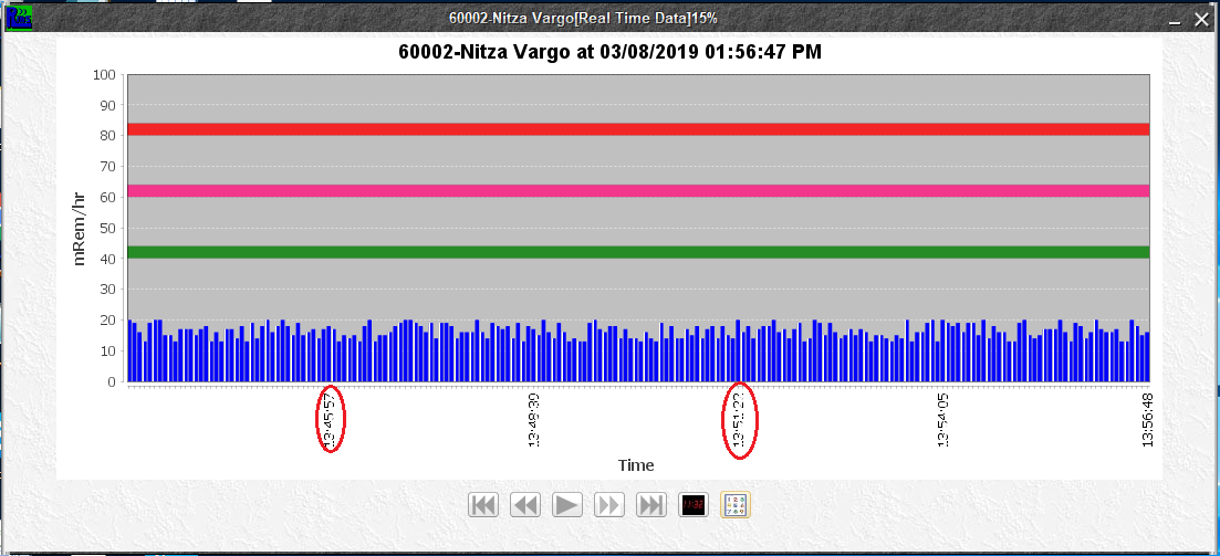 Is there any way to set the Time label count as 5 for 200 bars ?
-
FourW Support
- Posts: 7
- Joined: Mon Jan 14, 2019 3:17 pm
- antibot: No, of course not.
Post
by FourW Support » Wed Mar 20, 2019 12:16 pm
Currently We are using DefaultCategoryDataset.
-
FourW Support
- Posts: 7
- Joined: Mon Jan 14, 2019 3:17 pm
- antibot: No, of course not.
Post
by FourW Support » Mon Mar 25, 2019 11:03 am
Can you please give some sample code snippet to hide the Time labels ?
-
John Matthews
- Posts: 513
- Joined: Wed Sep 12, 2007 3:18 pm
Post
by John Matthews » Thu Apr 11, 2019 5:11 pm
FourW Support wrote:Currently we are using DefaultCategoryDataset.
For crowded bar charts, I use
SlidingCategoryDataset. Alternatively, consider switching to
XYDataset and use
SymbolAxis.