Hi,
I wanted to generate waterfall chart using jfree chart. Can any one help me?
Thanks
Madhaw
How to plot waterfall chart
-
david.gilbert
- JFreeChart Project Leader
- Posts: 11734
- Joined: Fri Mar 14, 2003 10:29 am
- antibot: No, of course not.
- Contact:
I'm not sure what a waterfall chart is...can you post an example?
David Gilbert
JFreeChart Project Leader
 Read my blog
Support JFree via the Github sponsorship program
JFreeChart Project Leader
-
Sir Henry
Waterfall chart
It seems that there are differing definitions of what a waterfall display is.
In my context of frequency spectrum analysis, I would like to display a 3-dimensional dataset like it is done in the Bubble Chart Demo. I have time on the x-axis, frequency on the y-axis, and amplitude on the z-axis. Spectrum analysers normally visualise the z-axis with varying color intensities. Such a chart is in my context referred to as a waterfall display.
Has anybody got any experience with such types of charts, and would it be feasible to use JFreeChart for it?
Thanks for any response.
-
david.gilbert
- JFreeChart Project Leader
- Posts: 11734
- Joined: Fri Mar 14, 2003 10:29 am
- antibot: No, of course not.
- Contact:
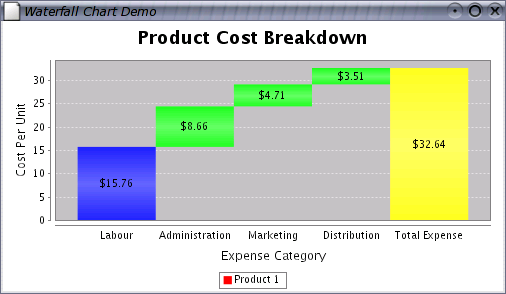
Since the original post, we've implemented the following "waterfall" chart (not what you're looking for):
The ContourPlot in JFreeChart sounds a little more like what you are describing - someone else wrote this code and I haven't done a lot of work with it, but perhaps you can try it out.
The ContourPlot in JFreeChart sounds a little more like what you are describing - someone else wrote this code and I haven't done a lot of work with it, but perhaps you can try it out.
David Gilbert
JFreeChart Project Leader
Read my blog
Support JFree via the Github sponsorship program
JFreeChart Project Leader
-
Sir Henry
-
Sir Henry

-
Guest
-
Kagetto
waterfall time/frequency/amplitude contour
Does anyone know how Sir Henry was able to accomplish the waterfall contour chart image shown here?
I am having a hard time figuring it out. If I feed the ContourDataset a bunch of XYZ points, it messes up the graph horribly. For instance if I do something like:
The code will not draw horizontal lines for the different y values specified and has only one color for z that shows at the far right end of the graph. I need it to draw all of the horizontal lines (which is why I have many x,z points for the same y) and interpolate the colors (the z values) between the x values I give it....
Any help would be awesome.
~Kagetto
I am having a hard time figuring it out. If I feed the ContourDataset a bunch of XYZ points, it messes up the graph horribly. For instance if I do something like:
Code: Select all
Vector x = new Vector();
Vector y = new Vector();
Vector z = new Vector();

for(int i = 0; i < 20; i++){
  y.add(new Double(i));
  for(int j = 0; j < 20; j++){
    x.add(new Double(j));
    z.add(new Double(j));
  }
}

CountourDataset data = new ContourDataset("Bleh", x.toArray(), y.toArray(), z.toArray());
Any help would be awesome.
~Kagetto
-
Kagetto
Change category colors?
Is it possible to change the color of each category seperately?
Java 11, JFreeChart 1.0.15, JFreeSVG 4.0
-
Kagetto
I may not full understand your question but you can change the colors of the Z axis using a ColorPalette:
~Kagetto
Code: Select all
        zColorBar = new ColorBar(zAxisLabel);
        zColorBar.setColorPalette(new color palette);
...
        ContourPlot plot = new ContourPlot(dataset, xAxis, yAxis, zColorBar);
-
m.ibbrahim
- Posts: 3
- Joined: Mon Aug 14, 2006 1:35 pm